CASE STUDY
Safe-In-Sight

PROJECT DETAILS
-
Timeline- Jan- April 2025 (14 weeks project)
-
Team- 2 UI-UX Designers, & 2 UX researchers (including me)
-
My core role – Ideation , Research & Usability Testing, Reports generation
-
Softwares/Tools used- Figma, Miro, Canva, Google Form
PROJECT
OVERVIEW
"What is Safe-In-Sight?"
In the fast-paced urban life, safety of pedestrians and people in transit is often a matter of concern. How can someone navigate the dark streets, in unknown surroundings or during isolated hours ensuring self-well-being?
To overcome such challenges and struggles that pedestrians, and cyclists face frequently, especially during late hours the idea of “Safe-In-Sight” came into light.
THE CHALLENGE
“If navigation apps like Google maps, Apple Maps, Waze etc. helps a driver navigate safely on roads with all essential features tailored to meet their needs. How can Safe-In-Sight create that kind of engagement for the pedestrians & cyclists?”
In our first group meeting, we discussed the scope of what Safe-In-Sight was trying to achieve and worked to identify how our team could ideate and strategize best to accomplish those goals within the given timeframe of 13 weeks. So, we distributed the work amongst each other based on our strengths and I took the responsibility of conducting research and collating the insights by mindful synthesizing. I decided to look for the existing gaps and opportunities for making an engaging experience for Safe-In-Sight’s niche target users.
RESEARCH &
PLANNING
The simplest starting point was to conduct primary research to get comprehensive inputs on pedestrian safety, while also capturing specific challenges faced by the users with a survey using google forms (quantitative approach) and personal interviews (qualitative approach). Both the methods aimed to identify which apps do pedestrians use the most to navigate? How they usually discover which route is safe to walk, what compels them to step out at night, and what frustrates them about finding the right and safest way?
Participant users were asked to fill the consent forms prior to the interview where the purpose of the data collection, confidentiality of statistics, and other ethical factors were rightfully cited in the guidelines as ethical code of conduct.
Me along with 1 other group member took 4 interviews with participants of diverse demographics and based on their responses we created the Empathy map to understand the needs better.

In the initial research phase, I conducted some moderated usability testing (Guerilla testing) of Google Maps and Apple Maps with 3 random pedestrians with an intent to gather insights about the interface and navigation safety features of these apps, how familiar were the participants with pedestrian centric features and how frequently they use them? How was their experience with the UI- is it seamless or frustrating?
The common findings and observations were as follows-
1. Pedestrian Route Choice & Safety
Participants subjectively perceived, integrated, and responded to the available information, and made their choice of route based on their decisions aligned to socio-demographic factors, built environment factors, and familiarity with the routes.
2. Technology-mediated Personal Safety
The technological advancements in such apps are designed for personal safety, however participants did not know where to find and how to use them.
3. Use of visual elements
Colors, icons, pop up alerts, etc. stimulates the user engagement and awareness for a better experience, but not all participants were able to derive right meaning out of it. They looked confused.
We could not rely completely upon the findings of interviews so we decided to widen our research with Google Form surveys using an intensive questionnaire across four categories: demographic information ; behavioral patterns ; psychographic traits-thoughts, beliefs, and mindsets ; and some generic perceptions to understand the user needs deeply. Clear trends began to emerge when I synthesized the data from the research, along with competitive analysis as secondary research. Key Takeaways from the competitive analysis were:
-
Google Maps & Apple Maps lack proactive safety alerts for pedestrians.
-
Opportunity to create a pedestrian-centric version of crowdsourced safety alerts.
-
Minimal emergency safety features like real-time danger alerts, emergency contacts, SOS functionality, etc.

Competitive analysis chart outlining the pros & cons of existing navigation apps that are commonly used.

Synthesizing the pain points and users expectations derived from overall research.
PROBLEM
STATEMENT
After lot of brainstorming and intense discussion about identifying and justifying the purpose of Safe-In-Sight, we refined our problem statement as-
"A female pedestrian needs safe navigation on streets because she believes that the existing apps have overlooked pedestrians as potential users and there is significant area of improvement pertaining to the safety and seamless experience for those who enjoy traveling independently.”
USER PERSONA
The research insights helped us craft persona of Sarah Thompson embodying “caregiver/everyman” archetype.

DESIGNING THE
SOLUTION
Safe-In-Sight isn't trying to be the next Google maps or Apple maps. However, given how familiar our target users are [Jacob’s law, a principle in UX design] with those apps, we began thinking around the core features of those apps and how to improvise the experience by either adding or revisiting few integrations that could be pedestrian centric to set Safe-In-Sight apart from its competitors.
What approach did we take?
-
Expand the limited understanding of pedestrians’ safe mobility practices and safety perception.
-
Direct the mechanism of app based on people's current practices regarding safety during walking.
-
Emphasize pedestrian safety with technology and smart objectives.
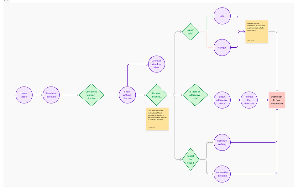
USER FLOW
The user flow revolves around making night-time pedestrian navigation feel secure, informed, and supported. Beginning with intuitive onboarding that prioritizes accessibility, users can plan safe routes based on real-time data and community insights. The app’s flow prioritizes user action, allowing for live navigation, safety alerts, and post-walk feedback, all streamlined into a smooth experience. Features like ‘Live view’, color coded walking path based on foot traffic and crowdsourced hazard reporting enrich the flow with proactive safety intelligence.
THE CONCEPT
The core idea of “Safe-In-Sight” is instrumental in advancing safety to one and all. By analyzing crowd density, flow patterns, and bottleneck situations, the simulator enables its users to evaluate safety in their environment or on-route, identify potential hazards, and be prepared with proactive measures. This collective sharing of information empowers our users to make informed decisions about their routes. As the dynamics of a city evolves, we as a community must be aware of how people living here or visiting here are impacted and what role we can play in keeping each other safe.
The ideation incorporates integration of advanced features such as –
· real-time crowd visualization
· interactive alert notifications
· ease of use allowing greater participation
· 24/7 responsive support

User Journey with design solution to display situational user flow
WIREFRAMING & PROTOTYPING

Low-fidelity sketches outlining the foundational layout and user flows for Safe-In-Sight. These early visualizations focus on key safety features, interaction points, and the app’s core structure to guide iterative design decisions.

Mid-fidelity wireframes demonstrating structured user flows, screen hierarchy, and key interface elements for Safe-In-Sight. These wireframes were used for initial usability testing and refining interactions with a focus on accessibility and nighttime safety for pedestrians.

Mock ups of High-Fidelity prototype displaying integrations of assistive icons on navigations screen, highlighted visual cues
generated from crowdsourced data, and reporting the hazard screen for pro-active actions ensuring safety and vigilance. These polished screens reflect branding, accessibility standards, and real-world functionality.
USABILITY TESTING
After building our final prototypes, we did moderated usability testing in 3 consecutive stages of iterate & build. The whole purpose was to evaluate-
-
if user is experiencing seamless navigation within the app .
-
if user is able to know/ report a hazard (e.g. road blockage, etc.)
-
how users interact with the assistive settings ensuring a safe and hassle-free trip.
-
friction points in the overall user experience process.
A/B Testing was also included to compare the old and new screens where changes in UI were made with either adding a new icon or replacing something with other, to find out if the new design is looking better against the old version.
CONCLUSION &
REFLECTION
“Safe-In-Sight” aspires to become a versatile solution to all navigational challenges that a pedestrian/ a cyclist faces in today’s time. Therefore, the following KPIs were drawn as actionable insights for the app design decisions-
-
User Engagement (How actively people use the app)
-
Safety & Risk Reduction (How well the app improves pedestrian safety)
-
Navigation & Route Efficiency (How well the app guides users)
-
Community & Crowdsourced Data (User contribution & reporting)
-
Business (For partnerships & sustainability)
These KPI’s will not only cater to the immediate navigational needs of users but also encourage exploration and interaction with the local environment, thereby enriching the overall user experience.
If I could do this project again, there are a few things I would have done differently:
-
Perform heuristic evaluations of the Safe-In-Sight app
-
Researched on the “Live View” feature’s mechanism to make it more intuitive & easy to use even with dim light
-
Learn more about AI in depth to understand how its use within the app can be feasible to enhance user experience
In hindsight, I think there were a couple of opportunities that we could have worked upon which emerged during UX research. We continued to design and iterate upon new features, whereas we could have made some recommendations by addressing usability issues.
Back